Herbie6590
-
Posts
6103 -
Joined
-
Last visited
-
Days Won
26
Content Type
Profiles
Forums
Uncouth Garb - The BRFCS Store
Everything posted by Herbie6590
-
FullSizeRender.mov
-
Wow...tough man to please
-
Probably saw this... https://www.bbc.co.uk/sport/football/45919720
-
 BRFCS catches up with Scott Sumner of 4000 Holes fame as he tells Ian Herbert all about the upcoming 100th issue of a much-loved fanzine. We also welcome a new 1st time contributor in John Wareing who shares some of his earliest Rovers memories. View full record
 -
Supporters Consultation Meeting
Herbie6590 replied to J*B's topic in Blackburn Rovers Fans Messageboard
I don’t get the disdain for Cheston. He’s an accountant. I know a few and the ones with charisma are very much the exception ? Thankfully none of them are Rovers fans so I might just get away with posting this. ? -
Supporters Consultation Meeting
Herbie6590 replied to J*B's topic in Blackburn Rovers Fans Messageboard
We played in our red & black away kit at home to Man City in the early days of the PL as well -
Supporters Consultation Meeting
Herbie6590 replied to J*B's topic in Blackburn Rovers Fans Messageboard
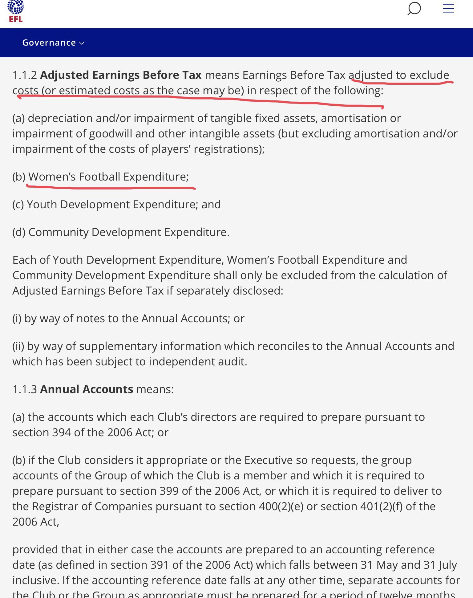
Calculating FFP losses isn’t just a case of adding up the losses in the club’s accounts. The FFP calculation is a separate one that takes into account allowable expenditure. So for instance the published (accounting) loss might be say £10m but that is calculated after say Academy costs of £3m. The FFP loss therefore would be £7m. This is highly simplistic but hopefully illustrative. -
This week's slightly extended "Accrington Observer" column... Drawn By The Riverside The landmark milestone was finally reached, albeit “bong-less” at 11pm last Friday. The arguments from both sides had played out and the final denouement was that Remain had won. That’s right, Rovers would remain with the squad with which they had started the window. On the plus side there were no Leavers, thanks perhaps only to Bradley Dack’s unfortunate and untimely cruciate injury. Enquiries were apparently made from Portsmouth to Poland, but Po'Rovers suffered “short arms but deep pockets” syndrome; not a signing, loan or permanent was forthcoming. In January 2019, just after the window closed, Darragh Lenihan suffered an injury, Rovers were then pummelled by Brentford and any optimism lingering regarding play-off prospects soon dissipated. The lack of incomings this time round was not a total surprise given the rumblings of FFP, but it was a disappointment. To stand still is to fall backwards in reality. Fans naturally always hope that a rabbit can be pulled from a hat – whether that bunny might be a veteran with fire still in the belly, dropping down a division or a youngster with a point to prove stepping up the leagues, but this time, nothing. All of that meant that the trip to Tony Mowbray’s homeland might prove to be something of an anti-climax. Of course, the previous away game hadn’t promised much either, but five goals later, the party was in full song. Rovers had once scored five away at Ayresome Park back in 1982 in a Noel Brotherston-inspired five-one victory over Malcolm Allison's side, but only the most rabid Rovers optimist (rightly as it transpired) expected another one here. If ever a match was set up to inspire its own round on BBC Two’s “Only Connect” then Saturday’s encounter with Middlesbrough at the Riverside was a strong candidate. Each team managed by a former Middlesbrough centre-back, one player* the brother in law of the opposing manager, a former Rovers striker on the Boro bench, a former Boro striker on the Rovers bench, a former Boro winger and a Boro midfielder sadly (for the purposes of this column..!) didn’t make it into the Rovers squad; but connections everywhere you looked. One by-product of the fallow transfer window is the opportunity it presents for some of the promising academy products. One of those for whom a bright future is predicted is Joe Rankin-Costello and here, he made his first start. It was Boro that started the brighter. Stewart Downing perhaps a little over-eager to make a point to his former employer received a yellow card for a late tackle on Nmecha barely four minutes in. Rovers struggled to impose themselves but when they did finally create a decent opportunity, a Gallagher cross aimed at Armstrong came to nothing. Boro then broke quickly and both Fletcher and Nmecha used their pace to cause anxiety. Rovers best response came when an interchange between Downing and Rankin-Costello gave Armstrong a chance to fire off two left-footed attempts in quick succession but to no avail. A Nyambe cross encouraged Rankin-Costello to challenge this time, but a collision with Aynsley Pears, son of Middlesbrough’s legendary keeper Stephen, resulted in a lengthy stoppage, a serious head bandage and the use of the numberless “blood shirt”, bringing back memories of Ian Pearce away at Shrewsbury back in 1993. Another injury setback saw Lewis Holtby depart proceedings shortly before half-time, opening up even more opportunities for young talent - on came er...Elliott Bennett. As the added time wore on, Rovers looked leggy and the half-time interval was a timely release of pressure. The second half saw another formation, with Bennett now fulfilling the “number ten” role and Gallagher once more out wide. Interestingly Rankin-Costello was now resplendent in blue bandages – half the game in white ones, half in blue – he’s one of our own alright. Boro continued to look dangerous and no more so than when Howson cut on from the wing and fired a shot just, only just wide of Walton’s right-hand upright. One straight out of the Armstrong playbook right there. The opening goal involved Armstrong but this time as provider. Lewis Travis had seemed to be suffering from his midweek exertions, but suddenly, out of nothing, he found a burst of energy that took him past a couple of Boro midfielders. From the halfway line, deep into the Middlesbrough box, a one-two with Armstrong neatly sidelined another couple and a left-footed shot was passed into the corner of the goal. Against the run of play perhaps, but a delightful goal from a deeply impressive player. The equaliser came following some nominative determinism when some wing-play from Wing resulted in a smart shot being parried by Walton, but only as far as the onrushing Coulson. Both Nyambe and Gallagher, static at the far post, could only look on in anguish as Coulson moved past them to score. "I'm gonna lay down my sword and shield...down by the riverside" Any chances that came in the last few minutes were largely as a result of the introduction of Rudy Gestede and his aerial threat proved hard to handle. One header in particular brought out the very best in Walton with a fabulous right-handed save from close-range. There was still time for Travis to earn a yellow card with a scything challenge that could have been classified as a “dark orange”. Last season 74 points got Derby in the play-offs so that means Rovers would probably need somewhere between 30-35 points from our remaining 16 games to reach that total, so to keep the arithmetic simple, 2 points per game on average. Could Rovers win say 9, draw 5 & lose 2 ? It’s highly unlikely, but not totally implausible...but let’s overlay reality now, we have lost our best player (and probably his replacement), have not been in the top 6 since Kean was here (I think...) and all of a sudden, it’s more of a pipe-dream. A top-ten finish (in other words, a five place improvement) would I believe, be a decent season all things considered. Rovers run of form over the last ten games illustrates the difference between play-off spots and also-rans. This very sequence includes five draws but just the two wins. Turning draws like that into victories, without the services of Dack, Holtby, Rothwell and Evans to deliver two points per game on average is a very tall order. However, with no squad reinforcements in January, the opportunity for those promising youngsters looms large, but you win nothing with kids, right ? One final footnote this week regarding the recently revealed and terribly sad news of Tony Parkes’ recent diagnosis. The very epitome of a club legend, always on hand to contribute in whatever fashion the club needed over the decades, the campaign to name the Riverside in his honour is the very least he deserves. What a servant to Blackburn Rovers and what a hero. *it’s Stewart Downing
-
Supporters Consultation Meeting
Herbie6590 replied to J*B's topic in Blackburn Rovers Fans Messageboard
Ladies football costs are FFP exempt as are stadium refurb costs.
-
Can we make the Playoffs?
Herbie6590 replied to Prelude's topic in Blackburn Rovers Fans Messageboard
You kind of selectively ignored the very next sentence...? Our best run of the season? P15 W8 D4 L3 Pts 28 @ 1.86 per game ...had we not lost Dack, Holtby, Evans & Rothwell...might we have continued that form? Well we’ll never know now, but it’s not a massive leap of faith from 1.86 ppg to 2.0 I would venture... -
Can we make the Playoffs?
Herbie6590 replied to Prelude's topic in Blackburn Rovers Fans Messageboard
Last season 74 points got Derby in the play-offs so that means we would probably need somewhere between 30-35 points from our remaining 16 games, so to keep the arithmetic simple, 2 points per game on average. Could we win say 9, draw 5 & lose 2 ? Put like that, it doesn’t sound totally implausible. But let’s overlay reality now, we have lost our best player, possibly his replacement, have not been in the top 6 since Kean was here (I think...) and all of a sudden it’s more of a pipe-dream. if we finish top ten, a five place improvement would I believe be a decent season. -
January transfer window 2020
Herbie6590 replied to GunnerRover7's topic in Blackburn Rovers Fans Messageboard
Have a listen to Darragh explaining how he came to Rovers here.... -
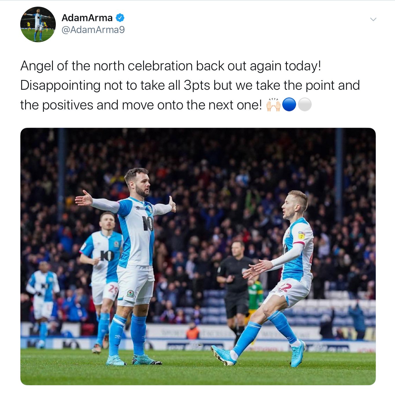
This week - a double feature - a slightly extended "Accrington Observer" column...followed by the pre-match preview from @LoftForWords A Kick Up the R’s Following Rovers rather ignominious exit at the hands of Birmingham City in the Third Round of the FA Cup, their reward was a weekend off. In fact, their reward was a warm-weather training break in warmer climes in Lagos – Portugal that is, NOT Nigeria, I won't ever make THAT mistake at the airport again. No such luxury for the supporters of course, robbed of our live football fix, we had to go shopping, walk the dog or rely on TV to watch Shrewsbury Town try their utmost to re-kindle the flames of “the magic of the cup”. Is it really just over a month or so that Rovers were riding the crest of a wave and speculation was rife that the January transfer window could be used to strengthen the squad? Talk was of a push for the play-offs, just a couple of prudent signings and bingo...roll out the red carpet! Since then, on-field, Bradley Dack was ruled out for the season and results seriously wavered; off-field, Venky’s accounts revealed a continuing financial tale of woe, FFP warnings openly discussed and the squad remains resolutely un-strengthened. Heading into Tuesday night’s encounter with QPR, Rovers found themselves firmly in mid-table but in this crazy division, still only six points off sixth-placed Preston and with a game in hand. You could conceivably make a case for a late rush for the play-offs for any team down to sixteenth-placed Derby County. All that is needed is a bit of luck and a run where a club won say five wins out of six games to close the gap. But what sort of lower-ranking Championship side could possibly string together such a run? Rovers kicked off with an unchanged side from the fabulous away win at Hillsborough. For the kit nerds out there, QPR were resplendent in a jade green outfit enhanced by almost unintelligible gold lettering and numbers, that on a warmer evening might have made me fancy a mint Cornetto. It was the Angel of the North celebration that was on display early on for Rovers as Joe Rothwell sprayed a lovely diagonal ball to Armstrong. He controlled in impressive if unorthodox fashion, enabling him to cut inside and look up, calibrate his shooting boot and curl a lovely shot inside the far post. This mirror-image Arjen Robben routine seems to be one of Armstrong’s most effective party pieces. Rovers continued to have the upper hand, moving the ball around impressively through a midfield axis of Rothwell, Holtby and Downing with Travis acting as minder. It was Travis who next came close, pressurising the keeper into a mistake but the attempt rolled along the line rather than over it and it was gratefully hoofed clear by Rangers. Downing continued his modus operandi, operating in midfield like a one-man DHL service; dropping deep, collecting as required, distributing effectively, delivering the ball as if it was a precious Ming vase to be protected at all costs. All that is missing is a card behind the front door when his colleagues aren't on the same wavelength. Nyambe too picked up where he left off at Hillsborough, rampaging down the right at every opportunity. Rovers were defying the chills and warming to their task, forcing Chair to sit back and provide a defensive cushion to cover the dangerous and energetic Rothwell. A poignant moment then followed in the twentieth minute with a round of applause to mark the recent, untimely passing of a young Rovers fan, Tiana Thompson. Shortly afterwards, Rangers had their first real attack of the game, a long ball finding Hugill who frankly beasted Lenihan, knocking it down to Chair who returned the favour and Hugill needed no second bidding to chip over the onrushing Christian Walton. All square, out of nothing, thanks to one lapse of concentration. Unsurprisingly, this encouraged Rangers to be more progressive and raised anxiety in the home defence and home fans alike. Rovers were now having to work a lot harder to retain possession. Rovers regained the lead from a corner, even though Rothwell placed the ball conspicuously outside the quadrant (VAR? What is it good for?), then crossed for Darragh Lenihan to power home a header across the keeper to make it 2-1. How nice to report on an unmarked header in the penalty area being for Rovers benefit rather than against. One little cameo worthy of note towards the end of the first half had Rothwell and Armstrong combining outside their own penalty area to snuff out a QPR attack. Tenacious, determined and effective, it was lovely to see the unglamorous work being relished with such enthusiasm. The last few minutes were a tad torrid, Todd Kane (yes, him) crossed dangerously but Rovers hung on for the half-time whistle with their advantage intact. The second half started with Rovers bringing on Bennett for Rothwell who had not recovered from the knock sustained right at the end of the first half. It was clear early on that Rangers were determined to impose themselves on proceedings and this they did. The influential Eze started to dominate the midfield, probing and pressing, bringing his teammates into the game. Rovers struggled to hold the ball and when Travis did, in his fiftieth Rovers start, he was fouled roughly, three times in quick succession, drawing the first three yellow cards of the game. Travis seems to be becoming a marked man amongst Rovers opponents these days, presumably they recognise the danger he presents? Chances however, were few and far between, the best being a free-kick from Downing, but not having the necessary whip nor dip to trouble the Rangers keeper and later, a header from Gallagher failed to hit the target. Darragh Lenihan imposed himself on the game once more, this time defensively, proving that Rangers most certainly had a collapsible Chair in midfield, as Darragh absolutely scythed him down and rightly earned himself a yellow card. Rovers it seemed had now settled for the 2-1. Pressure built, but Rangers couldn’t create a clear-cut chance, the final whistle blew and the sense of relief was palpable. A modest attendance of 11,505 (excepting the 292 from QPR) went home happy. Next up for Rovers, is a trip to the Mowbray/Downing heartlands of Teesside. Rovers find themselves in tenth but astonishingly, only four points outside the play-offs. It will probably need more “arte” than was on display tonight to close that gap, but the “labore” is not an issue based on this evidence. Preview From Loft For Words https://www.fansnetwork.co.uk/football/queensparkrangers/news/51832/from-a-home-defeat-by-luton-to-a-5-0-away-win--interview From a home defeat by Luton to a 5-0 away win - Interview Tuesday, 28th Jan 2020 03:32 by Clive Whittingham Blackburn Rovers are a team almost as ludicrous as QPR, with defeats to Luton, Charlton and frequently Birmingham set against big wins at Sheff Wed and elsewhere. Ian Herbert tried to make sense of it all for us. How would you assess the season so far? Largely underwhelming. Much like a DVD box set where the script writers like to keep the plot twists and cliff-hangers flowing to maintain interest, the performances and results so far have ebbed and flowed from the ridiculous to the sublime to keep us on tenterhooks. Lose at home to Luton, demolish Sheffield Wednesday at Hillsborough, standard Rovers fare really. Our current league position of mid-table is probably a fair reflection of the totality of our efforts thus far. On our day, we can play some decent stuff, but much like England at a tournament, as soon as we come up against anyone good, we tend to lose. That said we have also conjured up home defeats to Charlton and Luton plus away defeats to Birmingham (twice...once in the cup...against ten men) and Huddersfield along the way, so losing to mediocrity is now a core competency. Rovers are an equal-opportunity opponent. League Results So Far: Blackburn 1-2 Charlton (Phillips og 54 – Purrington 43, Taylor 77) Fulham 2-0 Blackburn (Cairney 34, Mitrovic 81) Blackburn 1-0 Middlesbrough (Graham pen 25) Hull 0-1 Blackburn (Williams 62) Blackburn 0-0 Cardiff West Brom 3-2 Blackburn (Phillips 22, Livermore 31, Diangana 40 – Dack 1, Johnson 45) Blackburn 2-0 Millwall (Williams 18, Dack 74) Reading 1-2 Blackburn (Swift b57 – Armstrong 8, Dack 48) Blackburn 1-2 Luton (Travis 37 – Collins 17, Pearson 57) Blackburn 1-1 Forest (Armstrong 63 – Lolley 65) QPR 4-2 Blackburn (Wells 30, Eze 48, Osayi-Samuel 60, Hugill 77 – Dack pen 57, Armstong 88) Blackburn 2-2 Huddersfield (Holtby 20, Dack 33 – Grant pen 13, Bacuna 63) Birmingham 1-0 Blackburn (Colin 31) Preston 3-2 Blackburn (Barkhuizen 53, 82, Johnson pen 65 – Rudd og 1, Gallagher 11) Blackburn 2-1 Sheff Wed (Adarabioyo 88, Buckley 90 – Murphy 83) Leeds 2-1 Blackburn (Bamford pen 30, Harrison 35 – Williams 40) Blackburn 3-2 Barnsley (Dack 24, 86, Downing 69 – Chaplin 48, Woodrow 82) Blackburn 1-0 Brentford (Dack 11) Stoke 1-2 Blackburn (Evans og 80 – Dack 13, Gallagher 84) Blackburn 1-0 Derby (Armstrong 54) Swansea 1-1 Blackburn (Ayew 10 – Graham 4) Bristol City 0-2 Blackburn (Johnson 2, Armstrong 77) Blackburn 0-0 Wigan Blackburn 1-1 Birmingham (Armstrong pen 55 – Mrabti pen 63) Huddersfield 2-1 Blackburn (Stankovic 25, Mounie 71 – Graham 7) Forest 3-2 Blackburn (Lolley 22, Grabban pen 25, 55 – Downing 39, Worral og 71) Blackburn 1-1 Preston (Armstong 3 – Harrup 17) Sheff Wed 0-5 Blackburn (Holtby 19, 45, Dawson og 36, Lenihan 48, Gallagher 90) Much like us it’s a 5-0 win one week and a disaster the next, why so inconsistent? If we could solve that mystery we could take on all-comers. We haven’t been helped by injuries but that excuse could be proffered by virtually every team in the league in reality. Tony Mowbray has developed a resolute habit of tinkering with his line-ups, formation and tactics - often within the same half - but ultimately, we lack a bit of real quality and the injury to Bradley Dack hasn’t helped that. Unforced individual errors creep in, morale slumps, effort falls away, results go awry...the players then seem to buck their ideas up...rinse & repeat. Fine margins in the Championship this season, sometimes we have been on the right side, sometimes not. It’s astonishing that we are still in with a chance of the play-offs having lost more than a third of our games. Crazy division. Where is the team strong and weak? Best players/weak links? Midfield is probably our strength simply because we have stockpiled midfielders much like Sainsbury do Creme Eggs come January 1. Notwithstanding injuries and illness a plenty, we can currently boast one of the Championship’s brightest young things & one of its most accomplished veterans. Lewis Travis is the BYT and seems recently to be adding an element of “shithousery” to his range of many talents. He has taken to winding up the opposition and their fans at will these days and is eminently capable of adding a cherry on top by then setting up or scoring a goal. A terrific prospect with a great future if he continues to develop. The gnarled veteran is Stewart Downing. Our best thirty-something signing since Mark Hughes (was Danny Graham 30 when we first signed him ? - subs please check). Downing treats possession with the utmost respect and has a passing range that is the envy of his teammates. He’s certainly shown the cynics (me...) that he still has value to add. Our defence has been brittle most of the season. Loan keeper Walton has dropped a few clangers but of late seems finally to be settling in, another loanee Cunningham had his season cut short by a cruciate injury, the third defensive loanee Adarabioyo has provided height, strength and culture to the back four; but he can’t do it all on his own. Fans attitude towards Mowbray? Seems to be polarising. One camp “the hawks”, are convinced that Mowbray is not the man to lead the club back to the Premier League and that every match he remains in charge is an opportunity wasted. They point to his spending, reluctance to blood youngsters and constantly playing players out of position. The other, “the doves” argue that he has brought us back from League One at the first time of asking, is a thoroughly decent chap, has stabilised a footballing madhouse and so deserves patience and time. The main problem with Mowbray is that he has been significantly backed in the transfer market but his record is poor. The signings of Brereton (1 in 13) and Gallagher (4 in 27) for c.£12m have potentially brought us once more to the brink of FFP trauma and now of course, we can’t even sell Dack to balance the books. Mowbray’s best signings (Dack apart) have probably been the loanees he has brought in; Reed last season, Adarabioyo and Cunningham this. Venky’s though seem to be generally satisfied with the stability he has brought and I can’t see any imminent change on the horizon. Of course were they to decide to make a change, the chances of them actually competently hiring someone better are at best uncertain and perhaps this concern stops any sustained and vocal anti-Mowbray sentiment from taking hold. As long as we are improving our league position year on year whilst not threatening our financial future, I’d take that. Hopefully Mowbray can deliver but at the moment he’s drawing down on the reserves of goodwill. Any January business? To keep the fans happy (Cynical? Me?) there seem to have been a few rumours in the local press of “bids being prepared” for Polish wingers and goalkeepers but nothing tangible nor in reality, hugely credible. Expectations are rock bottom, but on the plus side, they are being fully met. The club’s cheque book remains firmly under lock and key. Sightings of it in action next week seem less likely than Bradley Dack starting on Tuesday night. Perhaps we could try to sell Ewood Park for say £250m to the company that bought Pride Park off Derby County ? Ins: Sam Gallagher, 23, CF, Southampton, £5m >>> Stewart Downing, 34, LM, Free >>> Bradley Johnson, 32, CM, Derby, Free >>> Tom White, 22, CM, Gateshead, Undisclosed >>> Lewis Holtby, 29, AM, Unattached, Free >>> Christian Walton, 23, GK, Brighton, Loan >>> Greg Cunningham, 28, LB, Cardiff, Loan >>> Tosin Adarabioyo, 21, CB, Man City, Loan Outs: David Raya, 23, GK, Brentford, £3m >>> Paul Downing, 27, CB, Portsmouth, Free >>> Charlie Albinson, 22, GK, Southport, Free >>> Jack Rodwell, 28, DM, Released >>> Craig Conway, 34, LW, Released >>> Ben Gladwin, 27, CM, Released >>> Scott Wharton, 21, CB, Northampton, Loan >>> Charlie Mulgrew, 33, LB, Wigan, Loan POTY candidates? The aforementioned Travis and Downing are amongst the front-runners. Adam Armstrong is trying to fill the Dack-shaped goal scoring hole of late and if he keeps it up, will be in the conversation certainly. If I had to award it right now, Downing just shades it for me based on his all-round contributions thus far. Expectations for the rest of the season? After Dack was ruled out for the season we went on a wretched run that suggested relegation might rear its ugly head but things have since stabilised thankfully. I predicted 12th in your pre-season preview and I still expect to be within one place either side of that come season’s end. Play-off talk is fanciful but we should have enough to steer clear of any trouble. Famous last words...*gulp*. Links >>> Official website >>> Lancashire Telegraph – Local Paper >>> BRFCS message board and podcast >>> Rovers Chat – Blog >>> Our reciprocal interview with Rovers Chat The Twitter @ianherbert, @loftforwords Pictures – Action Images
-
January transfer window 2020
Herbie6590 replied to GunnerRover7's topic in Blackburn Rovers Fans Messageboard
Because somebody told them they could “lease” players ? -
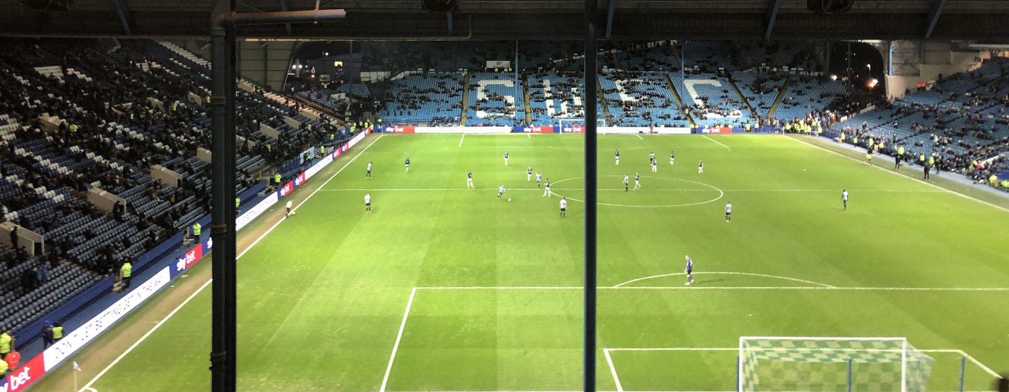
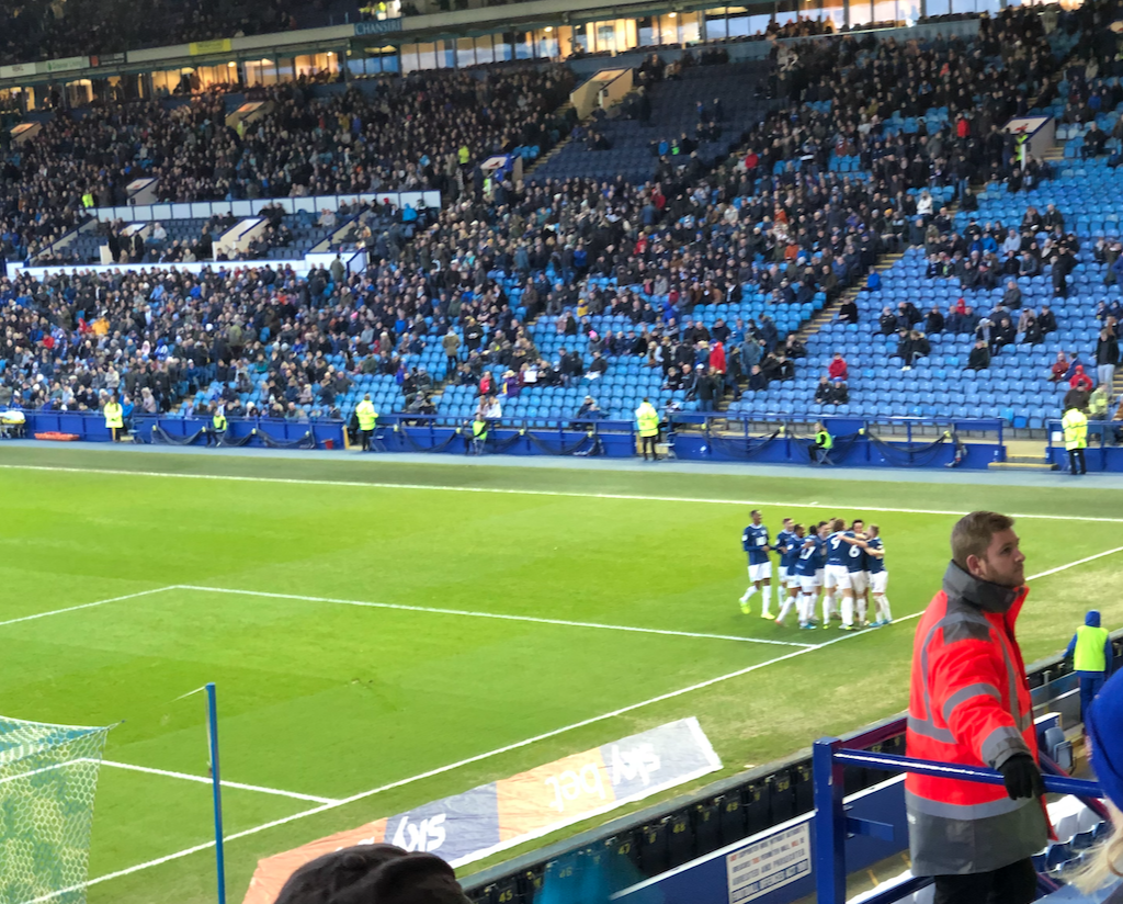
This week's "Accrington Observer" column...with a few added extras... Five Star Rovers Offer Owls No Sanctuary Thanks to the city planners of Sheffield over many iterations, the streets around Hillsborough are a warren of one-way systems, traffic lights, tram-only streets and on match-days; coned-off carriageways designed to allow the departing spectators a sporting chance of getting at least half a mile away from the ground without being run over. Experience therefore dictated that last Saturday I would park a little further away from the ground and ensure that I would not get caught up badly in post-match gridlock. I need not have worried. Football supporters the world over travel to games with no certainty of the outcome. That is of course, the joy of sport; on the day, almost anything can and does happen. This isn’t cinema, theatre, ballet or opera – nothing is scripted. choreographed or is “in the can”; here, the actors make it up as they go along. Sport is competitive improvisation. Sometimes, let’s be frank, it’s pretty mundane, but equally, every now and then, you are fortunate enough to be present at one of those “I was there...” moments, memories of which you will carry with you for the rest of your life. Saturday was one of those for sure. Going into the game on the back of a winless run stretching to six games in all competitions, the pre-match mood was subdued, expectations structured, enthusiasm in check. Hillsborough is one of those traditional football grounds, a massive Kop behind one goal, stanchions obscuring your view, four completely different stands (though how the Leppings Lane stand has never been demolished and replaced remains an open wound in English football history). Rovers had a modest, but noisy and exuberant following, little did we know what was about to unfold. A bright start saw Rovers in a kit mash-up resembling a Dundee tribute act, dictating the speed and the pattern of the game. However, an early corner somehow found its way back to Walton in three passes leaving Lenihan, Adarabioyo and Gallagher marooned upfield, believing themselves victims of a practical joke. Rovers soon got into gear though, sharp inter-passing, movement off the ball, pace and no little invention followed. Who are you and what have you done with my Rovers? The opener came from Holtby but was a result of some persistence and invention from Armstrong who was causing mayhem, repeatedly cutting in at pace from the inside-left channel. An early goal up, we’ve been here before of course. Sam Gallagher in his now accustomed wide-right role looked a handful, cutting inside his marker, using his physique but invariably fifteen to twenty yards wide of goal. If only he could have the opportunity to run onto a pass through the middle eh? Nyambe too was immense, a warhorse on the right hand side, playing full-back, midfield and wing simultaneously. The next significant moment came when midfield powerhouse Lewis Travis won a 60/40 midfield challenge that drew a foul from Wednesday’s Massimo Luongo, interpreted by the referee as a red card offence. To the naked eye it was definitely a foul, certainly a yellow, but the red card was a surprise. We have been and will be on the receiving end of some dodgy refereeing decisions, that’s football, so when one goes your way, the imperative is to capitalise and for once, Rovers did just that. “It’s more difficult to play against ten men...” is one of the great football clichés and let’s be honest, Rovers have not always been arch exponents of despatching weakened opposition, so there was some trepidation at this point. Travis picked up the ball outside the area and shaped a lovely shot arcing towards the bottom left-hand corner only for it to hit the inside of the post, rebound off the back of Wednesday keeper Dawson’s head and dribble into the goal. At this point, Rovers felt that the tide was inexorably moving in their direction, but memories of Preston away are not yet expunged. Another football cliché is muttered in the away end; “next goal is going to be important...” Well so it proved, Armstrong and Holtby linking up menacingly once again ensured that the half-time pies, pints and coffees could be enjoyed in a more relaxed frame of mind, wrapped in the comfort of three-nil security blanket. The home fans vocalised their disappointment and large swathes voted with their feet, not returning for the second half. Social media chat then informed us that Rovers had once lost a game at Hillsborough in 1960...by five goals to four; surely not? Garry Monk threw the last remaining dice at half-time making his final two substitutions but the second half continued much where the first had left off. Downing conducting the orchestra, Armstrong and Nyambe troubling the full backs and centre backs with direct running and the defence resolutely solid, albeit under minimal threat from the featherweight Owls’ attack. A corner early on was volleyed home, side-footed by Darragh Lenihan with some aplomb and there we were; over forty minutes to go but no jeopardy at all. What fresh madness is this? Holtby went into full show-boating mode, Rothwell picked up a ridiculously unnecessary yellow and was rightly substituted to prevent the referee having the chance to even up the numbers. By now, the home fans that had remained in the ground were demanding red cards for Rovers players merely for breathing noisily in the general direction of their heroes. The steady trickle for the exits continued and it was at that point even the most jaundiced Rovers fan could start to relax and really enjoy the remaining half-hour, secure in the knowledge that there was no heart for the fight remaining in the opposition. The only remaining unresolved questions; how many more, could Gallagher score from the wing, would Brereton be introduced, is this the time for a Rankin-Costello debut? The answers; one, no – he moved inside to a central role to score...I know, yes and yes. The weight of pass from Rankin-Costello to Gallagher for the fifth was worthy of Stewart Downing himself, there can be no higher praise. Gallagher, made a robust case for being played through the middle by smashing it home with his left foot and that was that. Scoring five goals in a victory doesn’t come around too often, especially away from home. I’m lucky enough to have witnessed two such trips now, albeit more than twenty-three years apart; on an actuarial basis, I might just, possibly, see one more, I really hope so ! *Thanks to Andy Currie @andy_brfc for the "before & after" photos of an emptying Hillsborough
-
Winter Warm Weather Training Camp (Portugal)
Herbie6590 replied to a topic in Blackburn Rovers Fans Messageboard
I went to Lagos last year...this place was terrific ?
-
The points deductions might impact on any promotion push - see Birmingham City’s deduction last season
-
Monday caption contest
Herbie6590 replied to Bigdoggsteel's topic in Blackburn Rovers Fans Messageboard
“Hands up who fancies a chicken parmo in Yarm tonight...” -
January transfer window 2020
Herbie6590 replied to GunnerRover7's topic in Blackburn Rovers Fans Messageboard
Wasted on the young that...?? -
January transfer window 2020
Herbie6590 replied to GunnerRover7's topic in Blackburn Rovers Fans Messageboard
Yes, but perhaps not favourably ? -
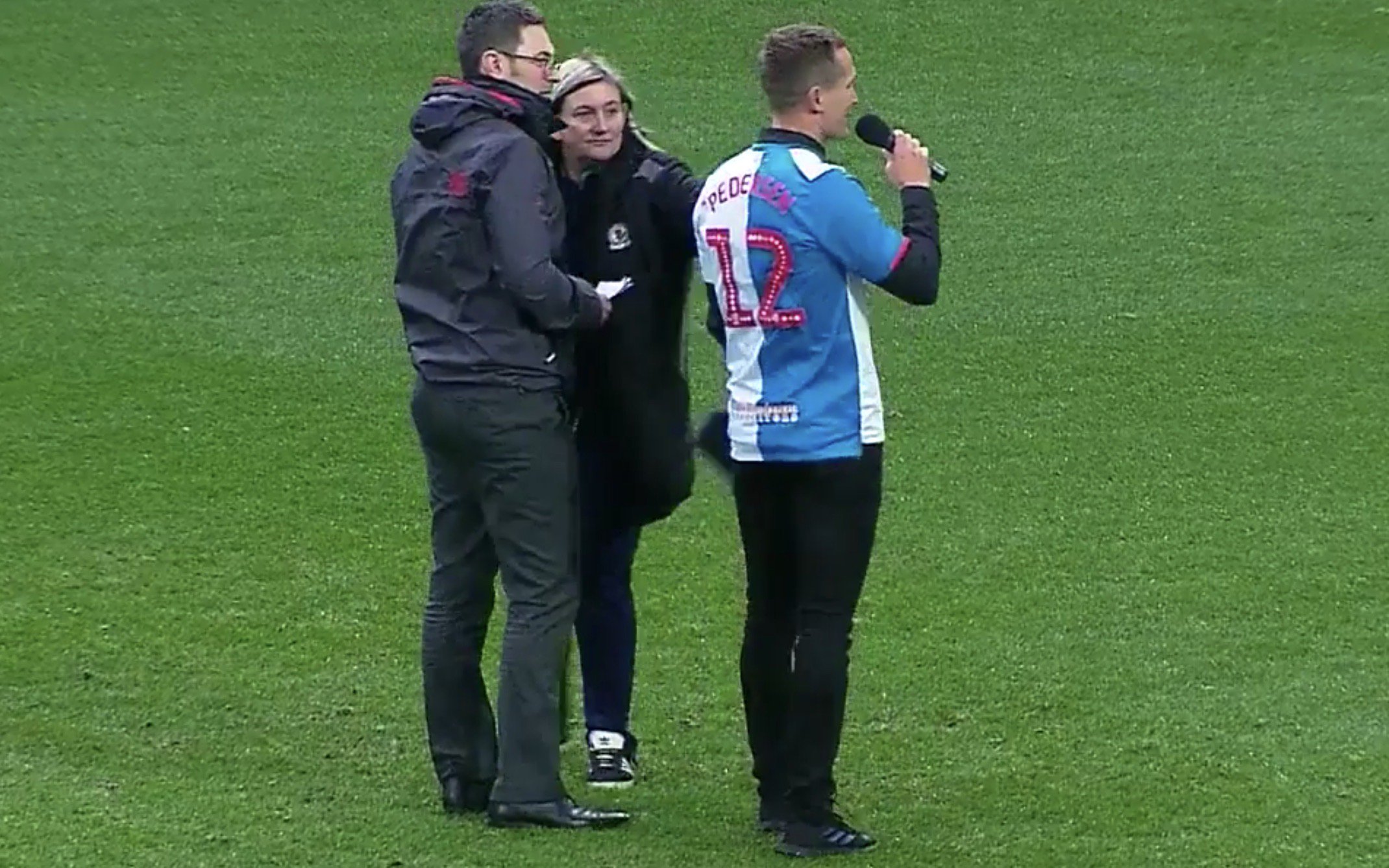
This week's "Accrington Observer" column...with a few added extras... Black(burn)adder Goes Forth Rovers fans: “But it’s the same plan that we used last time...and the seventeen times before that...” Gen. Sir Anthony Cecil Hogmanay Mowbray: “EXACTLY...& that is what is so brilliant about it. It will catch the watchful opposition totally off guard. Doing precisely what we've done eighteen times before is exactly the last thing they'll expect us to do this time!" (with humble apologies to Richard Curtis & Ben Elton) For quite some time now, Rovers have been struggling to find a solution to the “Danny Graham Question”. Graham has proved to be one of the best value for money signings made in the Venky’s-era and perhaps even further back. The unique skills, experience and characteristics he provides sadly do not as yet include eternal youth and are proving very difficult to replace. Of course, that was before the untimely and unfortunate injury to Bradley Dack which has served to bring the problem into even sharper focus. Dack and Graham have proved to be quite the double-act for Rovers, instrumental in both the promotion success from League One and in establishing the newly-promoted side in the Championship. But now Tony Mowbray faces the task of replacing the both of them at the same time and it’s proving to be quite the conundrum. Mowbray seems to have been a proponent of the wide-striker concept for some time. Back in 2017, he signed Marcus Antonsson on loan from Leeds to play wide-left and in January 2018, added his former Coventry City confidant Adam Armstrong on loan from Newcastle to play wide-right. Armstrong’s pace lends itself to taking on and outpacing a full-back but despite this, "#minishearer" seems still to have a hankering to play through the middle. This approach has continued in the Championship albeit with a changing cast list. First Ben Brereton was brought in late in the summer 2018 transfer window. Sam Gallagher, a former Rovers loanee that had worked under Mowbray at the end of the fateful relegation season returned on a permanent deal last summer. Each has been played in the wide-right role but with little tangible success thus far. Last Saturday, against PNE, once again we enjoyed/endured the spectacle of a 6 feet, 4 inches tall striker labouring down the right flank, trying to link up with an overlapping right-back in Ryan Nyambe, all with the intention, it seems, of providing crosses for the diminutive Adam Armstrong (5 feet, 8 inches tall). I have noted in previous columns that this is a tactic that was used by Mark Hughes; but once, in specific circumstances, aimed at allowing Roque Santa Cruz to exploit Patrice Evra’s stature. It was not the default setting. Armstrong of late, thankfully, seems to have revelled in the opportunity to fill the goal-scoring vacuum created by Dack’s absence, but the bizarre spectacle of Rovers continually launching long, high balls down the middle and Gallagher trying to provide crosses from the flanks to him remains mystifying. Armstrong is clearly most potent when receiving the ball to feet, running directly at retreating defenders, unsettling them with his pace and so it proved early on against Preston. Once more against North End, Rovers hit the ground running and took an early lead. However, there were a number of Rovers fans who insisted that tactically, the worst thing Rovers could then do on Saturday was to make that a two-nil lead; dark humour indeed. As it transpired, there was no need for concern. Following a lengthy hold up which saw the unfortunate Corry Evans stretchered off following a painful and probably season-ending encounter with head-high boot of Clarke, Paul Gallagher played a delightful free-kick into the Rovers box. Despite the close attention of Johnson and Lenihan, perhaps inspired by Harry & Meghan, they chose that moment to step back from actual front-line defending. The knock down fell to Harrop who smashed the ball into the top right-hand corner leaving Walton helpless. The lead had lasted less than a quarter of an hour. Steve Waggott may well have attributed this goal to the presence of Preston fans in the lower tier of the Darwen End. What then transpired, was either a competitive local derby with neither side able to establish superiority or frankly, a dull match in which two out of form, but evenly-matched sides struggled to find any real fluency to their play – depending upon your perspective. Once more Rovers failed to better their Lancashire rivals – seven games now since a Jordan Rhodes inspired Rovers came out on top. As the poet John Hegley once quipped, "The main difference between Blackburn and Preston, is that Preston is more western...". There was little to choose between the two sides here. The highlight possibly came even before kick off, when Morten Gamst Pedersen emerged from the tunnel looking as sprightly as many of the current first-team squad and resplendent in a current Rovers shirt bearing his name and the number 12. The outstanding contributor on the field was also a veteran left-winger, the doughty Stewart Downing, another with a trusty left foot and a few years MGP’s junior; his every touch silky and considered. For those of sufficient vintage, his range of passing and ability to find a yard to cross are reminiscent of David Wagstaffe. Though Downing’s fitness levels are possibly a tad higher, Waggy’s left foot could land the ball pretty much on a given blade of grass so arguably he didn’t need to run. Rovers haven’t had much success in signing veterans in recent years but Downing thankfully has certainly halted that trend. For Tony Mowbray, the search for a Baldrick-style cunning plan goes on. Brereton wasn’t even in the squad on Saturday, rumours suggest a loan move to the Netherlands to join ADO Den Haag is in the offing and that might be best for all parties. Alan Pardew may not be everyone's cup of tea, but if he can rekindle some form in Brereton then his Wembley cup final dance deserves a reprise. Gallagher continues his struggle for form from out on the right-hand touchline and Danny Graham looks a little like Ernie Wise did after Eric Morecambe’s passing, lost without his partner in crime and contemplating a life in retirement. The January transfer window is still open but the overwhelming message coming out of Ewood is seemingly one of austerity, expectations are low, but for Mowbray, the problems grow. Charlie Mulgrew has seemingly opted to return to Rovers from Wigan rather than continuing his loan...perhaps he can play outside-right ? Mulgrew's 27 goals from 99 appearances is a strike rate that seems unlikely to be matched any time soon by Gallagher or Brereton. Next up a trip to Hillsborough and for me, a local match that offers the prospect of being back home before even 606 starts. Whether General Mowbray tries something different is open to question; after all, doing what we’ve done on nineteen previous occasions is the very LAST thing that the Owls will expect.
-
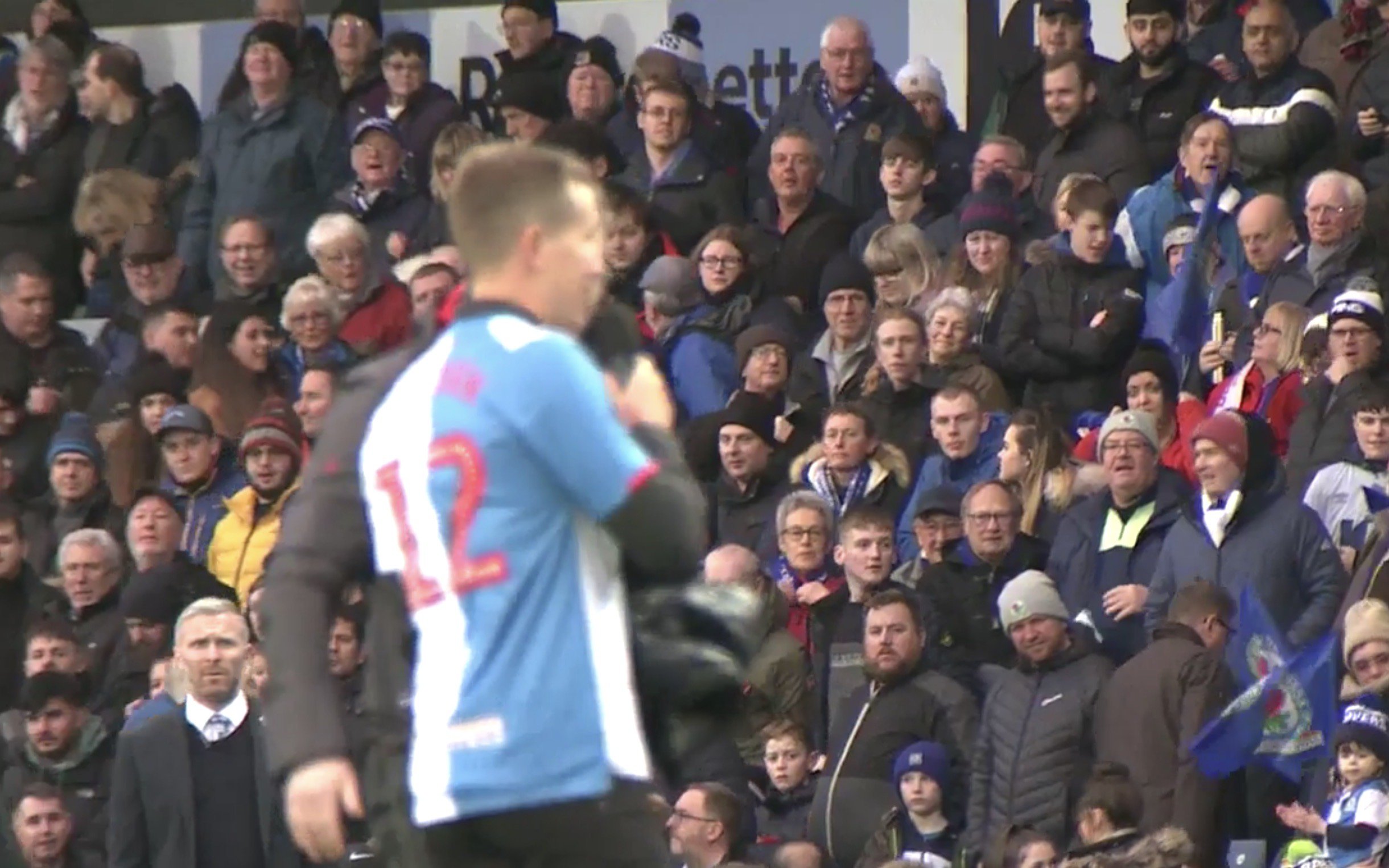
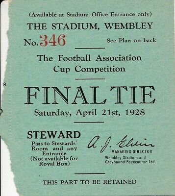
Angel Of The North
-
Rovers Trust’s Suggested Marketing Prospectus
Herbie6590 replied to Herbie6590's topic in Blackburn Rovers Fans Messageboard
Podcast out now featuring @mhead -
In this episode, Ian Herbert chats with John Murray from the Rovers Trust to learn more about the Trust's recent marketing prospectus and the memorandum of understanding with the club that is in the pipeline. If you want to know what the Trust is up to now, how it's role has evolved & what's in the marketing prospectus - this is the podcast for you! https://www.roverstrust.com/2019/12/18/brfc-draft-marketing-prospectus/ View full record
-
This week's "Accrington Observer" column...with a few added extras... Lack of Dack Sets Rovers Back They say you don’t choose your football team, rather it chooses you by dint of circumstances. Call it fate or luck if you will. Just imagine the alternative. A sort of due-diligence process, whereby you scored your potential team on various characteristics and arrived at a “suitability ranking”. Many modern-day supporters happened at their favourites by simply looking at the league table or if more cosmopolitan, the Champions League winners’ roster. Had I been able to decide on the criteria to be used in such a scorecard, the prospects of my potential club to reach the FA Cup final would have been one of the key factors. I loved the FA Cup. (My choice of tense there is a conscious decision). I am of a generation that remembers FA Cup final day as being one of those rare occasions when you could watch a live game on TV (not even the League Cup final was broadcast live back then). The week after, you then had England v Scotland live in the Home Internationals, truly saturation coverage. I loved the whole FA Cup final day; much like an over-indulgent wedding, paid for by a proud father of an only daughter; no expense spared, nothing too good for his pride and joy. All that pomp, circumstance and sense of occasion rolled into an easy to consume televisual feast. The build-up, long before the days of reality TV let’s not forget, had cameras at the team hotels, on the coaches, circling helicopters following their route, pre-game interviews on the pitch; I couldn't get enough of this heady mix. Add an FA Cup final edition of “It’s A Knockout” and “Question of Sport” to the mix and that was your day pretty much sorted. I was insanely jealous of fans of lower level teams who reached Wembley – Sunderland, Fulham, Southampton, West Ham and QPR all had their moment of glory. Two semi-finals being the best we could muster; Cardiff and Old Trafford each great days out, but victory eluding us on each occasion. Morten, oh Morten, I still cannot believe you missed THAT header... We should really have won it during the Dalglish years. Victory in 1993 or 1994 would have made the perfect appetiser to the entrée of 1995’s league triumph. That Boxing Day knee injury to Alan Shearer possibly the significant contributory factor. Despite Steve Livingstone’s best efforts, the 1993 quarter final against Sheffield Utd will be remembered for a heart-breaking penalty kick defeat. Anyhow, enough whimsy, coming back to modern times – we now enjoy kick-off times all over the shop, half-empty, no three-quarters empty stadiums, VAR in some but not all games, replays in some rounds but not all, weakened teams being selected by clubs all over the country, TV coverage largely behind paywalls...what on earth has happened to this famous old competition? How did we, the supporters, ever allow it? Let’s be honest, the FA Cup is finished isn’t it? Well it most certainly is for Blackburn Rovers, for this season, before even the 3pm Saturday games kicked off. Saturday’s lunchtime encounter with Birmingham City was entirely in keeping with the current malaise surrounding the team. A number of chances created, falling to misfiring strikers, contriving on one spectacular occasion to block a goal bound shot of their own, with the Birmingham keeper and defence AWOL. Scant consolation is that Danny Baker no longer produces his famous "Own Goals and Gaffes" videos, for this particular clip would have been a shoo-in. Since that excellent win at Bristol City, the high point of an unbeaten run which raised hopes of January fuelling a promotion push, the talk has instead moved to noting that it’s now five games without a win in all competitions. Rovers seem to have discovered and mined a rich seam of inconsistency over the last 12 months or so with an efficiency that would have put the most productive members of the NUM to shame. This latest sequence though has caused more than a little concern, coming as it does after the serious injury recently sustained by Bradley Dack. There were plenty of unsubstantiated rumours doing the rounds that the current transfer window would see Rovers cashing in on their prime asset, a potential sale to West Bromwich Albion being the most vaunted destination. The recent publication of Venky’s London Ltd accounts (Rovers’ parent company) indicate that losses continue to grow despite promotion. If sufficient income can neither be generated on matchdays, nor via commercial activities, then logically, player sales is the only way to go. Of the current squad, Dack is very much the crown jewel, his injury may well have upset his fellow players, supporters and finance director equally, but for fundamentally different reasons. On the field, the Forest league game and Birmingham cup game highlighted that without Dack, Mowbray remains unsure which formation is the best alternative. Quite often, playing several different ones within the ninety minutes. Versatility is a much-prized asset but players like Stewart Downing have played at least four positions, Gallagher and Brereton continue to be used in wide positions and Armstrong has played wide left, right and centrally, often in the same game. The search for a “Dack-less formation” goes on, but this constant tinkering has been occurring for over a year; the inconsistencies in form likewise. The expectations of supporters for the window are now being managed by Mowbray with talk of there being “no treasure chest”. At best it seems, a loan or two, perhaps not even that. The “need to sell first” chat is gathering momentum, but with Dack injured, who else could raise the necessary finance? More to the point, cash in the bank doesn't score goals nor make saves or tackles, so it would have to be spent wisely – and how confident would any fan be in that regard currently? Sadly, the two substantial fees spent by Rovers in the last year have resulted in under-achievement and deep disappointment. Sam Gallagher and the increasingly forlorn Ben Brereton, seem unable to live up to the promise ignited by the size of their fees. Of course, the fees aren’t set by the players but they seem to be having a similar effect on them as a sizeable fee once did on Kevin Davies. The impact on Brereton especially is heart-wrenching. Many Rovers fans will have read Matt Jansen's excellent book over the Christmas holidays and will have learned of the fragile nature of confidence and how difficult it is, once lost, to restore in an elite athlete. At this point, one has to wonder whether Rovers should engage the services of a sports psychologist like Prof Steve Peters to work with Ben to rebuild his confidence. If you spent £7m on a supercar, you would in all likelihood ensure it was regularly serviced and maintained. Rovers cannot afford to write this fee off, they surely must consider all options to recover this situation and help the player. Ultimately as we know, Davies had to leave, start again and reinvent himself (very successfully) at a local rival under the tutelage of a manager once described by David Dunn the best man manager he ever played for, yes, Sam Allardyce of course. Right now, given the pressure that is starting to build and the recent caustic press comments of the manager, the chances of Brereton, Gallagher and Mowbray all being at Ewood in January 2021 seem slim. Curiously though, at that point, by dint of circumstances, we will almost certainly still have Bradley Dack.