-
Latest Products
-

1995 Names L/S Tee - Away
In Stock -
1995 Names L/S Tee - Home
In Stock -
Home Kit Rose Bobble Hat
In Stock -
Pink Chunky Knit Rose hat
In Stock -
Pink Snowstar Rose hat
In Stock -
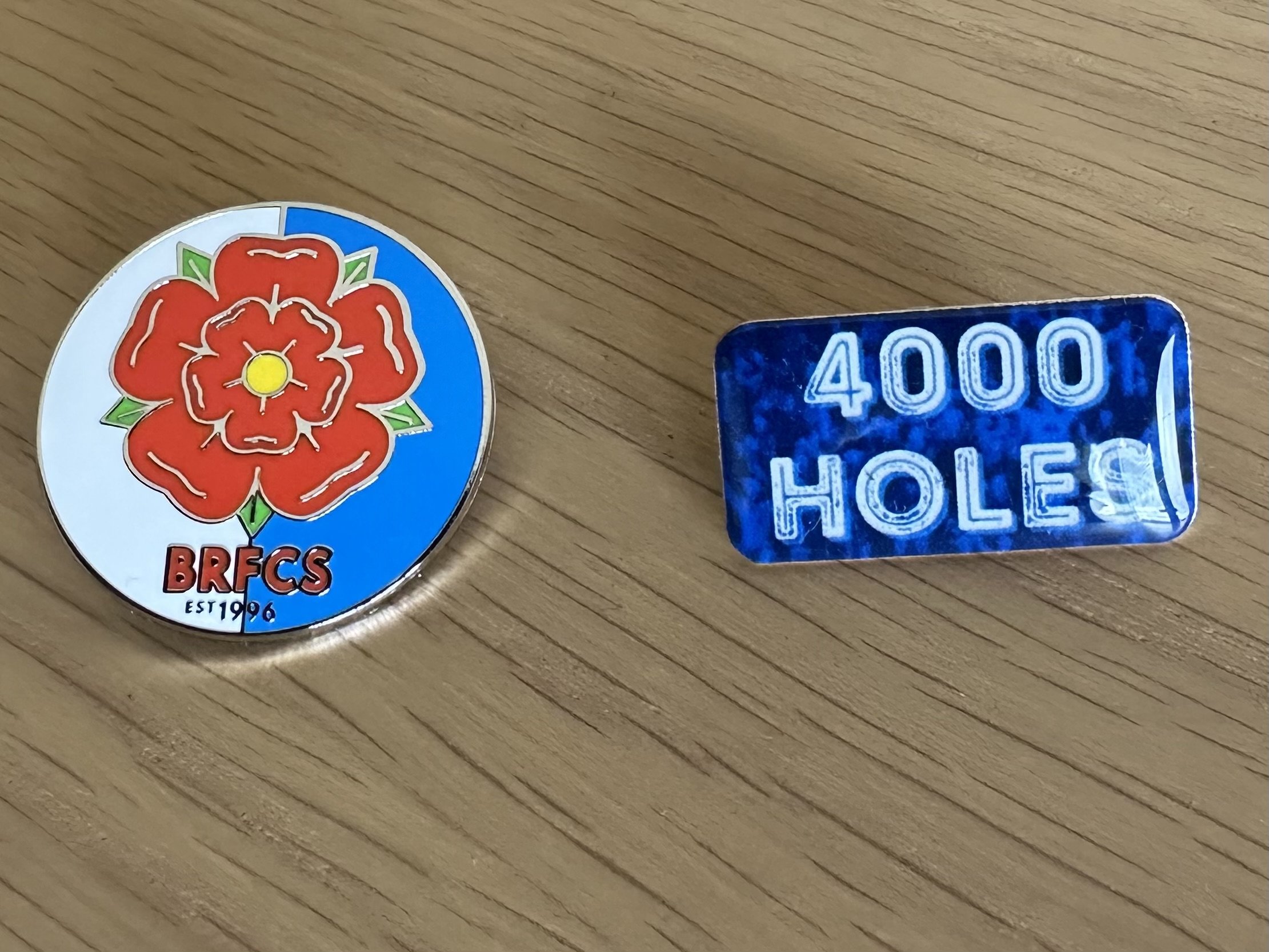
Pin Badges
In Stock -
Away Kit Quarter Zip Sweatshirt
In Stock -
Away Kit 4000 Holes Bobble Hat
In Stock -
Away Kit Scarf
In Stock -
Pink 4000 Holes Beanie Hat
In Stock
-
BRFCS
SINCE 1996


Recommended Posts
Archived
This topic is now archived and is closed to further replies.