IrelandsRover Posted September 5, 2021 Share Posted September 5, 2021 Hi all forgive me if this is a topic that’s been covered. I was wondered which kits have been our worst over the years. I think these are particularly horrible myself 1 Quote Link to comment Share on other sites More sharing options...
This thread is brought to you by theterracestore.com Enter code `BRFCS` at checkout for an exclusive discount!
Mattyblue Posted September 6, 2021 Share Posted September 6, 2021 90s goalkeepers tops were all pretty garish, I only ever have fond views of anything from that era. 1 Quote Link to comment Share on other sites More sharing options...
SuperBrfc Posted September 6, 2021 Share Posted September 6, 2021 For me, a lot of our worse looking kits have been seen post 2012. A lot of them since then have had a 'cheap' look about them, imo. The red RFS one from 13/14, the turbo green away one from 14/15, the grey away shirt from 19/20. Shockers. Wasn't impressed with the yellow away shirt in 18/19 either. The best home shirt in a long while, I felt, was last season's one. Macron have done a good job overall this season, the away one in particular is a belter. 2 Quote Link to comment Share on other sites More sharing options...
Sparks Rover Posted September 6, 2021 Share Posted September 6, 2021 That grey and green one was a bit shit. 1 Quote Link to comment Share on other sites More sharing options...
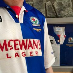
Popular Post Gav Posted September 6, 2021 Popular Post Share Posted September 6, 2021 (edited) Hideous and it clashed with Hendrys hair.... Edited September 6, 2021 by Gav 11 Quote Link to comment Share on other sites More sharing options...
BlackburnEnd75 Posted September 6, 2021 Share Posted September 6, 2021 05/06 the lonsdale / lonsdale kit. Great season, bad kit. 1 Quote Link to comment Share on other sites More sharing options...
Displaced Rover Posted September 7, 2021 Share Posted September 7, 2021 (edited) Goalkeepers shirts in the 90s were supposed to be garish, I don't think they're particularly bad. I quite liked the orange one, I had that with Sutton on the back as a young chap. Worst kits for me were the Nike era. We may as well have ordered them straight out the team kit catalogue for all the effort they put in. The worst one definitely being the pale blue disgrace with Zebra Claims on the front. Edited September 7, 2021 by Displaced Rover Typo Quote Link to comment Share on other sites More sharing options...
Popular Post LeftWinger Posted September 7, 2021 Popular Post Share Posted September 7, 2021 I remember having this one as a kid - which I thought was great - but I know a lot of other people thought it was awful. I still like it! 10 Quote Link to comment Share on other sites More sharing options...
Bigdoggsteel Posted September 7, 2021 Share Posted September 7, 2021 1 hour ago, LeftWinger said: I remember having this one as a kid - which I thought was great - but I know a lot of other people thought it was awful. I still like it! Same, one of my favs 1 Quote Link to comment Share on other sites More sharing options...
SuperBrfc Posted September 7, 2021 Share Posted September 7, 2021 3 hours ago, LeftWinger said: I remember having this one as a kid - which I thought was great - but I know a lot of other people thought it was awful. I still like it! Ah, that brings back fond memories. Our club shop was at the back of Shoe Zone in town in those days. I remember going in as a kid with my dad, excited to buy the new away shirt only to then see it. "Nah, we'll leave it" was the agreed response 😁. It was in the days of no internet, no social media. There was something quite fun in not knowing what our new kits looked like upon release, until you visited the club shop or if you managed to see somebody wearing it out and about. Imagine that today. 1 Quote Link to comment Share on other sites More sharing options...
Mattyblue Posted September 7, 2021 Share Posted September 7, 2021 Or you’d have a player modelling it in the LT, as a certain number 9 did in our new CIS kit… and then buggered off about a week later. 😭 1 Quote Link to comment Share on other sites More sharing options...
Herbie6590 Posted September 7, 2021 Share Posted September 7, 2021 Anything & everything Lonsdale. Shabby, awful, dreadful Mike Ashley Jumble Sale tat. 1 Quote Link to comment Share on other sites More sharing options...
Herbie6590 Posted September 7, 2021 Share Posted September 7, 2021 1 hour ago, SuperBrfc said: Ah, that brings back fond memories. Our club shop was at the back of Shoe Zone in town in those days. I remember going in as a kid with my dad, excited to buy the new away shirt only to then see it. "Nah, we'll leave it" was the agreed response 😁. It was in the days of no internet, no social media. There was something quite fun in not knowing what our new kits looked like upon release, until you visited the club shop or if you managed to see somebody wearing it out and about. Imagine that today. I remember once being faxed (ask your parents) a photo from the Telegraph 🤣 1 Quote Link to comment Share on other sites More sharing options...
Gav Posted September 7, 2021 Share Posted September 7, 2021 8 hours ago, LeftWinger said: I remember having this one as a kid - which I thought was great - but I know a lot of other people thought it was awful. I still like it! I'm not having anything bad said about any yellow kit, if nothing else they made for a great atmosphere away from home, regardless of what they looked like. "Yellow yellow yellow" 3 Quote Link to comment Share on other sites More sharing options...
AJW Posted September 8, 2021 Share Posted September 8, 2021 The orange way kit was horrid , the plain white way one with red shorts was just bland and I’ve never been a fan of the pale blue and white halves 2 Quote Link to comment Share on other sites More sharing options...
IrelandsRover Posted September 11, 2021 Author Share Posted September 11, 2021 On 07/09/2021 at 16:59, Mattyblue said: Or you’d have a player modelling it in the LT, as a certain number 9 did in our new CIS kit… and then buggered off about a week later. 😭 Quote Link to comment Share on other sites More sharing options...
Nuttall is lost Posted February 4, 2022 Share Posted February 4, 2022 https://cdn.cultkits.com/media/59782/img_7601.jpg?width=651&height=871¢er=0.5,0.5&mode=crop Hated this one. Quote Link to comment Share on other sites More sharing options...
Dreyski Posted February 4, 2022 Share Posted February 4, 2022 (edited) I don't even remember these two, admittedly both 3rd kits: found on https://www.footballkitarchive.com/blackburn-rovers-kits/ Edited February 4, 2022 by Dreyski Quote Link to comment Share on other sites More sharing options...
bluebruce Posted February 4, 2022 Share Posted February 4, 2022 I've never really liked the orange, grey or yellow away kits. Very rare I buy any of the third kits too, though that's largely cos two kits a season is plenty thanks... Quote Link to comment Share on other sites More sharing options...
Bbrovers2288 Posted February 6, 2022 Share Posted February 6, 2022 I’ve had a few of these haha. I have a certain fondness of the orange kit. that light light blue home one was terrible for me, just looked wrong. The darker blue the better imo Quote Link to comment Share on other sites More sharing options...
Upside Down Posted February 6, 2022 Share Posted February 6, 2022 After the asics era things went down hill right up until the crown paints shirt. That was a great one. After that they've been pretty average right up until this season with macron. That copper away shirt was absolutely horrible and a rare slip of form for asics as everything else they had done was gold. Quote Link to comment Share on other sites More sharing options...
Mattyblue Posted February 6, 2022 Share Posted February 6, 2022 The copper one was deemed our ‘continental style away shirt’, all very cosmopolitan… not sure I remember Red Star Belgrade or Steau Bucharest wearing it though… Quote Link to comment Share on other sites More sharing options...
Nuttall is lost Posted February 6, 2022 Share Posted February 6, 2022 Surprised tobody else named the 95/96 away. Absolute muck with the black badge. Ugh! It was so bad they lost almos every game in it and halfway through the season tried to go back to the much much nicer 94/95 away. Wouldn;t see that now! Quote Link to comment Share on other sites More sharing options...
Recommended Posts
Join the conversation
You can post now and register later. If you have an account, sign in now to post with your account.